Thursday 31 May 2012


SYNOPSIS
‘the colour of winter is in the imagination’

imba (Shona – native Zimbabwean language)
(noun) a home, a place where ones comfort and affections are centred.
Manako Imba delivered couture outfits with strong silhouettes, daring features, unusual fabrics, distinct colours and hand painted prints.
Imba runs with the same thought as Manako Imba but is comfortable, more casual, younger and loves to layer.
Imba knows that winter can be dull, dark and tirelessly miserable, but wants to change this. Imba is the sunny hour in a day of rain.
With striking colours and an array of unusual prints inspired by the colours and patterns of Africa; Imba is all about the wearer making choices. Each piece available in at least one other colour or print, “the colour of winter is in the imagination” – so, as the owner of a variety of pieces, why not mix and match? Layer it up? Make the outfit your own. For the more daring wearer, combining the very different prints offers an unexpected bang of colour, which surprisingly works; for those less audacious, the single colours can help calm things down a little.
The collection is designed to maximise comfort  - being named after the words home and affection, it only makes sense that the garments offer this - and practicality: for the busy-bee customers.  Signature coats and capes to wrap up warm in the outside winter chill are easy to take-off for inside. With loose layering basics in organic cotton and merino, Imba has made sure that being comfortable and looking stylish has never been more effortless. For those with little time to put together an outfit (it is quite likely that the Imba girl is like this!), there is little to worry about as the colours and print do the talking.
Imba’s outerwear is made of 100% New Zealand wool and made onshore, here in New Zealand. The 100% New Zealand merino and organic cotton jersey-knit basics are also made onshore. With onshore prices being higher than offshore, the prices for these pieces are in the higher price range of the mid market. As a result, to keep costs lower across the brand, and as accessible as possible for the 
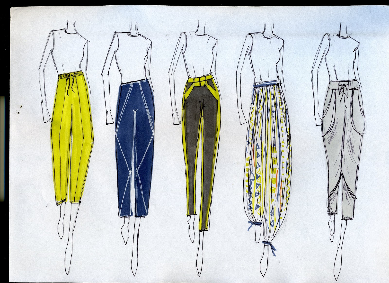
Imba market; the construction and printing of the other garments (pants) are taken offshore. Made in viscose, linen and polyester, these pieces are aimed to be easy care and easy wear. The average Imba consumer doesn’t have the time and cannot afford to dry-clean a pant after every wear; therefore no-stress fabrics have been used as opposed to silk etc. Finishing details such as topstitching and interesting panelling are included in the design and construction of garments because the Imba girl is one who knows about detail – she pays attention to it.  

The Imba girl is studying or at the beginning or her career, she is street-wise and enlightened. She is independent and creative. She is happy.
She is happy because she wears Imba.


Final Lineup


Wednesday 23 May 2012

Drawings for final lineup

To create my final lineup. I drew my outfit outlines in pen then scanned them in, from there I added colour, print, textures, a head, arms and legs, and shadows all on photoshop. Below are the drawings of what I think the final line-up are going to be... there will obviously be changes to it as I start editing on photoshop and seeing how it all looks...


The pants for this look will be a very soft, drapey fabric, probably a viscose or polyester that drapes well. They will have an elastic band at the waist with drawstrings. The choice of fabric relates to them being easy care and washing etc. AS with all my pants, I think silk woud look beautiful - but they are simply not practical: especially not for my market. The pants will have little elastic just above the ankles to bring the shape of the pants in. The cape is thick NZ wool, has panelling details around the shoulders and a Mao-style collar. The cape will be lined. Underneath is a basic merino layering top. A very comfortable and easy inside-outside outfit.


This outfit is very realxed and comfortable too. The knit is soft nz wool and slightly chunky, the turtle neck is loose fitting - quite like a cowl neck; it adds a bit of interest and colour to the outfit. The pants are a comfortable soft fabric, perhaps a knit or viscose, they are slimmish fitting and become gathered/rouged at the ankle - bringing them in and adding a little shape. The tie around the waist is attatched to the pants waist band and is there is offer a layered up look. Basic layering tees and singlets are worn underneath.


This cape is a really cool design I feel,  it is simple a rectangle and at the shoulders it is folded in totoward the centre and buttoned to create the triangular look. This will be lined too and made in a thick NZ Wool. The cape is free to move in and easy to whip on and off as the wearer goes about her daily activities. Underneath is a simple t-shirt dress, over-size styled it is meant for layering up - will be available in a range of colours and prints. Leggings have interesting panel lines on them with topstitch detail to be a bit different from anything other leggings. These leggins wil be a great staple as the will go the the t-shirt dress and all the capes and knits. So comfy too!


This is one of my favourite looks! I like this because it can be dressed up a little smarter and dressed down a little more casually depeneding on the shoes and accesories etc. I really like pants that are slightly cropped and just graze the anke  as they can be folded up for a more cropped style or left as they are. I also think they are flattering. I like the top-stitched panel down the centre as this draws the eye in making the legs look narrower. The knit is chunky and quite loose fitting. The turtle neck is not tight either. I like the dropped hem of the jersey as this adds another dimension to the layering effect.


These pants ar similar to the ones talked about above however they are slightly more loose fitting and button at the bottom. The top of them is a draw string and elastic waistband - easy easy! These pants can be worn in summer easily too. The cape is a beautiful thick nz wool with a double collar for a bit of interset and layering! The wearers arms can come from the arm holes at the front or can just be worn without the armholes and come out at the bottom. The cape has contrast piping and topstitching as feature finish details.


I love this jersey! Made up of different colour sections of knit they form this shape/pattern. This jersey is fun! It would brighten up any outfit. It is made of nz wool and it quite a fine knit - not too chunky, this makes it drape well. Underneath are layers of singlets and long sleeves basic - all have dropped hems to add to the layering look. The pants are body skiming - being not too tight makes them a comfortable wear. They are availabe in a range of colours - - bright yellow/green to dark grey; depending on how daring/brave the wearer is!!


These pants are a great style! Look fun in a print but also just as interesting in a plain colour. The panels and stitching really add that extra bit of interest to them. These can be worn long or folded up a layer or too for a more cropped look. The coat is quite structured, made of thick nz wool and has lots of top-stitch detail and a sewing lines to create  interesting lines and panels. The shoulders are quite a strong silhoette. I really like the dropped hem at the back - it would be very cool if the lining was a completely contrasting colour or if the li ning was one of the prints!
Cracked Earth & Flame Lily Prints...


After showing Holly and talking to her about my Flame Lily prints and how they really were't working, how they looked like they were missing something, and my unsureness on whether they would fit into my collection or not, she gave me some really great advice.
She talked about putting something else in behind them or enlargening some and changing the transparency of them to give them more depth. DEPTH being the key word! She suggested I look up William Morris to see how he achieves depth through the sizing of parts of his paintings etc...


After thinking about this, I then went onto see what I could do... I came up with the idea of inserting the cracked earth print behind the flamelilys at a different opacity, to see what it looked like...

I really really like how this worked, I think it gives the flame lily print some definite depth. It also healps like the flamelily print into the rest of the collection. The print is different, dynamic and new, I feel that my target market would wearing - its a print that isn't for everyone, but I feel that they would wear it!

This print excites me. I think it would look great on some of the pants I have designed.


Triangle print...

As well as the cracked earth print and flame lily print, I really want to have a print that I very geometrical, and ties in all the colours I use in a very starightforward and uncomplicated way. So because the pattern will tie in all the colours, they will be very bright and colourful, so therefore must not be too complex as they may become a bit oo much... I decided on triangles and these are the prints that I have come up with... I am really happy with them and I think that these would look great on pants, a tee or dress etc... I like the added sketchy black lines separating each triangle as it gives a less formal, more relaxed kind of look/feel.


Tuesday 22 May 2012

'Cracked Earth Print' cont...


Here are some developed variations of the 'cracked-earth' print, using the correct colours. I really love how this print has turned out, I think it will look great in the collection, and I feel that my target market might even wear it!! 
'Flame Lily' Print...


The Flame Lily, is the national flower of Zimbabwe. I have decided that I would really like to use the print in my collection fro several reasons.

The flame lily grew wild on our farm at the beginning of the rainy season and as a child Dad and I would go on big motorbike rides around the farm on the hunt for them to bring home. I feel that the plant is really beautiful and I think a really cool print could be created out of it. They have such a cool colour combination with their deep orangey reds, yellow and bright greens. They are like no other flower with their spindly structure and fire like structure.


To start off my print, I began by redrawing two different versions of the flame lily...
I repeated them, enlargended and decreased the size and created shapes and patterns, using the pattern tool on photoshop to help me..


I feel that this is a good start, however it looks like there really is something missing. They just dont quite seem right! And im not sure they weill 'go with' my earth crack pattern which could be an issue... I asked Jen Whitty what she though of them, and the feed back she gave was mostly positive, she liked the blue and white background ones the most.. Lathough, she did say that the blue and brown (darker colour options) looked a little halloweenish, the colours and the sort of fire shape gave off theis kind of feel to her - - - uh oh! Not what I want at all--- there is definitely something missing from the print or something not very right at all if this is what the look she is getting is! I need to woooork on it! 


Sunday 20 May 2012

'Cracked-Earth Print'

To begin my print designing excercise, I tried to think of prints in nature. Particularly african prints in nature.  Here were some of my findings...


While I did like some of these: hte bark in the top right corner I really liked, but it reminded me of camo wear, and I'm not a big fan of camo and I don't believe my target market would wear too much of it!  The sand dunes were also nice too, but a little too wishy washy wavey for me.
Although I like animal prints on the animals themselves, I am not the hugest fan of animal prints on clothing, especially if it is not done well. I feel that often it can look distasteful and tacky - I feel there is a fine line to cross and it is easy to get it wrong...

What I really want, is a print that comes from nature and is not necessarily recognisable as that print when it is put out of context... eg, animal prints would be no good as everyone knows what they are when being worn in apparel...I also want something slightly geometric to continue my african/maori geometric patterns from last project...


I really like the idea of cracked earth!
-it is geometric in a strange kind of way
- it isnt really recognisable when taken out of context
-it has a very african connection and feel to it when you know where it originates from...

After a little play on photoshop these are some of the prints that I have come up with... The colours are not quite ruight but they give an idea of the look/feel that I am going for. It was the first time that I learnt to use the pattern making tool on photoshop and I am so happy I know it now, it works really well, is very straightforward and there is so much you can do!!!

The image at top left was my sort of starting point after I had traced the shapes from a photo of cracked earth, I then went about applying different colours and backgrounds and extra outlines etc etc... The top middle image shows how I have combined to completed prints and changed the trasnparency to get the look - at first I really disliked this print but it ha grown on my heaps and I think it could look bangin' on a a pari of pants!! I'd wear them!!! Hopefully my target market will too....

 Still lots of  development to be done I feel, although I am on the right track...
Bill Cunningham

Last night I watched a documentary on Bill Cunningham, a well known fashion photographer. The film was not what I was expecting at all, I was expecting a big flashy phogographer who thinks he knows it all - takes good photographs, yes, but is also very loud and proud... Instead an old man, who seems shy and lovely, he knows what he likes and does what he likes and he's good at it.

Bill Cunningham is very well known as he is a fashion photograopher for The Times. He has really carved his own way in the fashion world, which I feel is really unique as so often people are copied and copied and copied. I really does what he loves and I think its fascinating. he doesn't follow trends himself, he follows the trends behind his camera. What I find really cool is that he only photographs outfits on the catwalk that he feels a woman would wear. Which I think says a lot about the fashion industry today. The docuamentary shows him out and about on his little bike doing his work for The Times - photographing fashion in action, fashion on the street. He photographs things that grab his attention and catch his eye, and he becomes obsessed with certain outfits or garments that he snaps a lot of.

If my collection were out there in the streets of New York, I really hope it would be photographed on the street, being worn and in the action - by him. To show that it is everyday kind of wear, its a little bit exciting, its comfy, it wearable and you can make it your own... 

Friday 18 May 2012

Designing my own prints...

My last projects collection focused very much on prints and african prints, particularly potato printing etc. I really want to caryy on this 'print' theme into this collection, especially as a way to brighten up winter! I want my prints ot be eye catching, fresh and use they must be using my colour palette. I'd also like them to have have an African influence or origin.

Here I have taken some scans out of books on print from the library...


1. The first print on the top left, I chose to photocopy because I really liked the geometrics of it. It doesn't look too shapey shapey and strong but some definite lines still feature. The colours contrasting as the lilnes cross looks quite cool too.
2. Top right print. Really loved this print, very fun and all over the place! I think this would look so cool on a pair of pants, but I think that it may look a bit childish to some people. Cool use of shapes of colour in the background to bring a bit of colour into the print.
3. Bottom left. Really loved the colour use in here. Pink may come across as very girly but I think that the green and yellow fixes this problem well - would look great on a layering top or pair of loose comfy pants!
4. Bottom right. Here is a photocopy of some african prints, particularly like the left and middle one. great use of colour in both of them and I feel they have some really interesting shapes - especially teh middle. May look a little too ethnic/african for my target market??


Now to start designing my own prints...


Monday 14 May 2012

My Target Market

My collection is aimed at young women (aged around 18-26), who are busy busy busy - love comfort but don't want to comprimise style for it - probably flat or live without their parents: so the clothes are easy care - love to layer clothes up: the more layered basics the merrier! Layer layer Layer! - love to mix and match and create their own looks - want colour and pattern: a bit of excitement in their lives! - are on the go and carrying all sorts of bits and bobs: so the clothes are sturdy and durable.

to be continued...


Design Development: Coats/Outerwear

As well as capes, I feel coats are an important part of a wardrobe - this is why I am including both a cape and coat in my collection - when some would argue that they are too similar. My target market have shown that they would buy a bright or different coloured coat rather than a black one because alot of money is spent on them they should be a little different to your average dull dark coat. So I have experimented with a few colours...I have still many to come up with/design. But I think that a coloured coat could sell well. However, I feel that I would produce the same coat in a more subtle darker colour for those that prefer a less daring outer layer.

More to come...

...

Great coat colour on the left... Different/cool style coat on the right...


Design Development: Dresses


Basic Tops and Layering Garments

Something that is very important to my target market are the basics - singlets, long sleeves tops and tees to layer up and wear as a base for something else - comfort, warmth, practicality and style are important! A great example of a label that I believe do basics really well are Bassike and KowTow. Bassike has a range of both woman's and men's basics in a beautiful soft cotton, some with stripes, other without, in a range of colours all perfect for layering in winter and wearing solo in summer. What I really love about their [products are how casual - yet how cool looking they are. Both KowTow and Bassike include unusual seam lines and panels to make a plain singlet or tee that little bit different.
Here I have designed a range of singlets, tees and long sleeve tops to layer up. The fabric of these basics will either be New Zealand Merino or a soft Organic Cotton - this means they will be great for winter and summer and feel like heaven against the skin! I have tried to include interesting panel lines and seams for a little bit of differences. A lot of these basics will have raw edges, which gives them a casual look. They will be available in a variety of different colours so that the more daring side of my target market can choose to go bright bright bright!

...


Design Development: Pants/Trousers

I am a pants person! I love wearing pants! I very rarely find myself wearing skirts or dresses, and I have found that I very rarely design skirts and dresses too... Although I am a pants person, this does not make me boyish - I really love feminine cuts, colours and prints. Here I have a variety of different pants. I have tried to design pants that would be comfortable, useful and great for layering up - both in winter - and with less layering in summer! They are casual - designed to be worn everyday with a pair of chucks or ankle boots - just like my target market. I have experimented with a variety of colour because colour is what I think, makes a simple (verging on boring) cut/style, interesting and fun!
While designing I found myself continuously designing plain boat-style pants with a desire to include different patterns and prints... sooo to accommodate this desire, the next thing I need to do is start designing some prints...